M/W 3:45–5:05 | section SIX | intro to graphic design | Renée Stevens
Author Archive
What I’ve Learned
Websites: The good, the bad, and the ugly.
First I’ll start with the good. I like the Apple website mainly because of it’s user friendly interface. I can tell exactly what I am looking it and how to get to where I want to be. The navigation bar at the top stays with me no matter what page I am looking at and gives me the option to browse any section of the website I want. I like the 4 column design but it doesn’t leave much room for large photos.
I love the Saatchi & Saatchi website. Their “About Us” page is so easy to use its incredible. The use a simple and clean typeface on top of interesting photographs to really capture the user’s attention. The best part about their website is the lack of clutter. The simple but elegant design is very refreshing.
Then we come to this. For my marketing class the book has us search through this website looking for product descriptions (I never found anything useful). The website says it was updated in 2008 but it doesn’t look like they’ve changed it since the 1990’s. The colors, typefaces, and layout are all miserable. There is little to no hierarchy and it makes the company look like it is being run by children. Apparently they sell novelty candy items for the holidays.
-Matt Smith
Sidebar
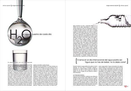
As I was walking through Newhouse tonight I found this copy of Zipped Magazine open to this page. Although I don’t think this is the most effective sidebar I’ve ever seen it still gets the job done. It is a bit text heavy which doesn’t help the overall design but it is definitely set apart from the rest of the layout.
-Matt Smith


