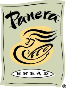
good & bad logos
 I think this is a good logo with regard to the color being used. The orange/tan in the middle might stimulate hunger like we learned in class. Also the light green background gives off a comforting vibe. The colors put together are relaxing and don’t look cheap, which works for Panera’s relaxing atmosphere.
On the other hand, I really dislike Kmart’s old logo.  The three different bold colors on this are too much for one logo in my opinion. Also they make the store seem really cheap because of the colors chosen. I think there’s too much going on here and the colors don’t really help it at all.
Katie Bresnahan
No trackbacks yet.