Poster hunt
I saw this poster in front of Lightworks and thought it was a successful poster. The picture immediately captured my attention and it has a good amount of white space that gives a certain elegance to the poster. The white space is also good here because it gives people space to breathe, unlike cluttered posters with hundreds of images and text. You can also tell that it is a poster about an art event thanks to the painting, so it successfully targets a specific audience.
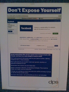
I though this poster was unsuccessful because the moment I started to look at it I could not find the information that the poster was trying to convey to the people. Below “Don’t Expose Yourself,” there is a picture of what a normal facebook login page looks like, but there was no new information or anything that might want to make me read the rest of the poster. Then I found out that the only place where there was information is in the blue box at the bottom, which also contains a lot of information and in a small typeface. I didn’t try to read it, which does not fulfill the purpose of the poster.


No trackbacks yet.